EDM Logo

9 Principles of Awesome Web Design

web design

There are several important factors to consider when developing a website that will influence how it is perceived. Making sure your website is designed for usability and ease of use will result in an excellent user experience. Because the only person who clicks the mouse and thus decides everything on the page is the visitor, user-centric design has become a standard approach for successful and profit-oriented web design.

Minimalism

The website must meet the needs of the user. On all pages, having a simple, clear intention will help the user interact with what you have to offer.

Simplicity is essential for your website’s readability and usability. Users rarely visit a site to enjoy the design; in most cases, they are looking for information regardless of the design. The best site design, in the opinion of visitors, is one that is entirely textual, with no advertisements or additional content blocks.

minimalism in web design

When your site is straightforward and easy to navigate, you can let your content shine. A clean, fresh design not only makes the site easier to use, but the aesthetics are more appealing and will last longer. This is one of the reasons why a print-friendly version of a website is essential for a positive user experience.

Typography is an important aspect of your website. You can demonstrate the personality of your company while drawing the audience’s attention right away by using the appropriate fonts.

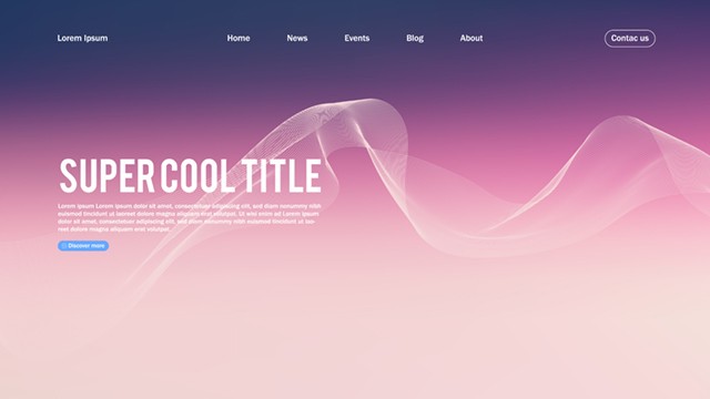
People will not read your content if it does not look appealing. Avoid using too sophisticated typefaces that look out of place on a website. Use standard, readable, and professional fonts that are easy to read.

But it’s not just about looking good. The typefaces you should select for your website design must be readable and web-friendly. Arial, Helvetica, Times New Roman, and Courier New are all examples of web-friendly fonts. Only three different typefaces should be used on the website.

It is also a good idea to highlight key words and phrases in bold and capital characters. You can also utilize different font sizes to spice up your text.

The color pallet you use in a design says so much. Finding the right color palette for your brand will allow you to influence your customers and make them feel good. Colors that complement each other work extremely well. Your color palette determines the mood of your web design. 

There are countless color combinations that you can choose when designing a website. However, you shouldn’t make it excessively wide or overly colorful. Keep the color palette to no more than five hues. It doesn’t matter if you choose colors that are close to each other or opposite each other on the color wheel; they must be complementary. Choose hues that reflect your brand and, more significantly, make the content simple to understand.

Visual Hierarchy

The arrangement of elements in order of importance is known as visual hierarchy. It helps readers in understanding the information and visual components of your website. You must purposefully structure your content so that it makes sense to the user. This is accomplished through the use of size, color, imagery, contrast, typography, whitespace, texture, and style.

A successful visual hierarchy teaches, attracts, and convinces people who have expectations, especially about the appearance of an interface.

Visual Hierarchy in Web Design

Utilize the ‘F’ pattern in web design

Humans are creatures of habit, and this includes how we consume material. The F-based pattern is the most popular approach for website users to browse material.

According to eye-tracking research, the majority of what individuals view is in the top and left sections of the screen and the right side of the screen is rarely seen. It allows readers to scan the information at the top of the page, scroll down to look at the bullets or important headers, and then go back up to read it again in more depth.

Using an ‘F’ pattern in web design entails mimicking the eye’s natural path so as not to disturb the visual flow. This is especially crucial on landing and sales pages, where conversion is the ultimate goal.

Or the ‘Z’ pattern

Another essential design idea is the ‘Z’ arrangement. When the eye scans from left to right, it forms an imagined horizontal line. Then it descends to the left side of the page, forming an imagined diagonal line. Finally, it returns across to the right, making a second horizontal line. You can use design elements to lead a reader’s eyes through the steps naturally.

While the ‘F’ layout works well for landing pages, the Z-pattern works best for sites with very little content and the major takeaway is the call-to-action.

Don't Fear White Space

This is the empty space between the visual components in your design, often known as blank space or white space. The space doesn’t have to be white. It could be the color of the background of your page.

white space in web design

White space, buttons, and other visual design features let images and text shine out while also keeping a layout from being cluttered. It not only helps to lessen cognitive strain for visitors, but it also allows them to perceive the information displayed on the screen.

When a new visitor arrives at a design layout, the first thing he or she does is scan the page and split the content area into consumable chunks of information.

In the hope of increasing visitor engagement, many ambitious marketers scramble to fill every available space on a page. But typically, this leads to pages that are excessive and unclear. Busy and complicated websites tend to overwhelm your users and hinder them from taking action. Meanwhile, the use of whitespace directs their attention to the most essential material, improves text readability, and produces a unified user experience.

Easy-To-Use Page Navigation

The navigation system used on websites allows users to engage and locate what they are looking for. The ability to navigate a website is critical to keeping visitors.

page navigation in web design

The user’s natural next move is to click “back” and try another website if they arrive at your website from a search engine looking for information but can’t locate it. Visitors will abandon your website if the navigation is difficult to understand.

A website that lacks clear navigation is similar to a maze that lacks a map. If the navigation and site layout are not simple, the number of question marks increases, making it more difficult for visitors to understand how the system works.

Maintain Consistency In Your Design

Understand that consistency is essential in web design. Seeing the same typefaces, colors, and symbols across numerous channels helps to establish the brand and portray professionalism. This will increase reader familiarity and trust, as well as demonstrate that you are a brand that is consistent in all you do.

Consistency can be improved through brand guidelines. Brand guidelines provide a thorough explanation of everything from content to colors. This also implies maintaining consistent space in your design.

Randomly placing content on your website can result in a chaotic, unprofessional design. Grid-based layouts divide content into sections, columns, and boxes that fit and look proportioned, improving the appearance of website designs. Grids assist to structure your design and organize your information. It assists in aligning and keeping objects on the page neat and enforce order, resulting in a visually appealing website.

Keep In Mind The Audience's Attention

Using visual components to draw users’ attention to key parts of the site might aid your visitors to navigate without thinking about how it is meant to be done. A professional designer understands that it is not enough to create a website that they believe looks excellent.

Audience's Attention

To truly construct a website that stands out from the crowd, they must communicate directly to their target audience through design.

Think about the following to tailor your website’s design to your audience:

  • What visuals uniquely speak to your intended market
  • What style resonates with your audience 
  • What subjects your target audience visits your website to view
  • How to use web design to communicate your brand positioning

Some parts of the user interface draw more attention than others. Evidently, visuals are more appealing than words. Web users can rapidly perceive edges, patterns, and movements since the human eye is a highly non-linear instrument.

Use Efficient Writing and Make Sensible Image Selections

An excellent website has both outstanding design and amazing content. Great content may attract and influence visitors by employing appealing language.

Sales promotion text will not be read. Long text blocks with no photos will be ignored. Overly dramatic wording will be disregarded. Because the Internet differs from print, the writing style must be tailored to the interests and surfing patterns of the readers.

Efficient Writing

Additionally, make sure your design and content follow the most recent search engine optimization best practices. The same web design advice that applies to developing SEO-friendly content also applies to it. You should design your web pages such that both people and search engines can easily read them.

Make sure that the photos you include in your site design are carefully chosen. They should be of professional quality and high resolution, as well as suit your overall style and have an obvious purpose. The correct images for your website can help with brand positioning and engaging with your target audience because a picture is worth a thousand words.

Pictures may be used in a variety of ways in web design, including conveying a story, explaining how a product performs, expressing emotion, and creating mood. You only have one chance to make a good first impression on a new website visitor. This is why it is critical to make your brand’s offering apparent to your consumers right away.

When using stock photography, use caution. Stock images could come off as corny and amateurish. For photos that appear authentic, think about hiring a pro to shoot pictures of your staff, your products, or your location.

Create Web and Mobile Friendly Designs

Making sure your website is accessible to everyone is what defines a great website. More users are browsing the web on their phones or other gadgets. It is critical to develop your website with a responsive layout that can adjust to multiple screen sizes.

responsive design

This includes ensuring that your headers and paragraphs operate properly on all devices, that no photos or other visual components are cropped off, and that your buttons are easy to utilize on a small screen. Users want to be able to explore your site fast, so make sure it is created with mobile users in mind.

Make The User Experience a Top Priority and Don't Waste Their Patience

Anyone who wants their website visitors to take action should pay attention to the user experience. This does not have to be a complicated or highly sophisticated procedure.

user experience

When offering a service or product to your visitors in any project, aim to make your user needs as simple as possible to do the appropriate actions.

The less activity necessary from users to evaluate a service, the more probable it is that a random visitor will try it out. Allow users to explore the site and discover your offerings without requiring them to share personal information.

Vitaly F. (2021, Oct 1). 10 Principles Of Good Web Design. Smashing Magazine. 

Nicole Singh. 20 web design principles to follow. Canva. 

Astra Editorial Team. (2023, May 1). 8 effective web design principles and design examples. Astra.