The Power of White Space in Graphic Design
White space, also known as negative space, is one of the most underrated yet powerful tools in a graphic designer’s toolkit. Far from being just “blank” or “empty” areas, it plays a critical role in how we interpret visual information. It helps designs breathe and enhances overall visual communication.
What is White Space in Graphic Design?
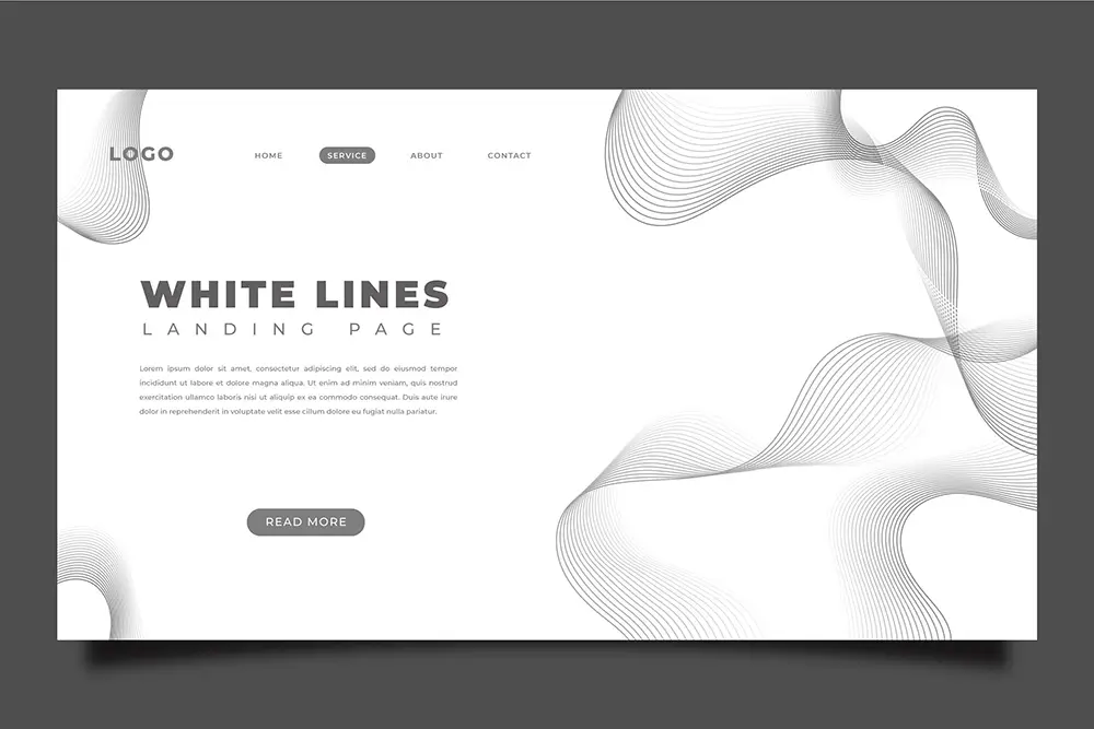
White space refers to the unmarked areas between elements in a design. It’s the space between lines of text, around images, within margins, and even between columns.
Two types:
- Macro white space
Larger gaps that define the structure of the layout (e.g., spacing between sections). - Micro white space
Smaller gaps appear between elements like lines of text or between buttons.
A common misconception is that it is a wasted space. In reality, it’s a powerful design element that creates balance, focus, and clarity.
For example, Apple’s website features generous spacing around elements, a deliberate strategy that focuses attention and conveys a sense of luxury.
Its Psychological Impact
It has a significant influence on how people perceive and process content. It contributes to:
- Improved Readability and Comprehension – Ample spacing between lines and elements reduces eye strain and cognitive load.
- Guides Attention – Designers control where the eye goes first, supporting the visual hierarchy.
- Cognitive Ease – Designs with appropriate spacing feel less overwhelming. It induces a calming effect that improves focus and memory retention.
Functional Benefits
From a practical standpoint, it holds multiple benefits across design types:
- Improves Legibility – Adequate line spacing and padding make reading smoother.
- Emphasizes Elements – CTAs, headlines, and logos become more impactful when isolated.
- Elevates Brand Perception – Brands use minimalism to signal elegance and sophistication.
- Boosts User Engagement – In UI/UX, it leads to cleaner interfaces and higher user satisfaction.
When users aren’t overwhelmed by clutter, they’re more likely to engage with your content or take action.
Common Mistakes Designers Make
Even experienced designers can misjudge how to use this element. Don’t fall into these:
- Overcrowding
Trying to fit too much on one page dilutes the message. - Inconsistent Padding/Margins
The lack of structure creates visual tension. - Ignoring Mobile Layouts
Poor responsiveness often leads to cramped or disjointed mobile experiences.
You need to be intentional about spacing in typography. When overlooked, it undermines the overall integrity of the design.
Use Space Effectively
To maximize its power:
- Utilize a grid system to create a solid structure for placing content.
- Maintain uniform margins, line heights, and padding.
- Use contrast and alignment to build rhythm and focus.
- Always aim for a design that communicates clearly over one that’s overly decorated.
Less is often more in an effective graphic design.
Conclusion
When used strategically, white space enhances readability, guides the user’s attention, and elevates the overall user experience. As you refine your designs, remember that space isn’t what’s left after the content is removed. It is the content.
At Ensemble Digital Media, we specialize in graphic designs that utilize strategic layouts to maximize clarity, engagement, and conversion. If you’re building a brand, launching a website, or revamping your marketing materials, contact us!
Key Takeaways
- White space is essential for readability, focus, and elegance in graphic design.
- Spacing enhances brand perception and the effectiveness of UX/UI.
- Applying consistent spacing and visual hierarchy creates harmony and professionalism in layouts.
References
- Apple. (2025). Apple. Apple. https://www.apple.com/
- Lidwell, W., Holden, K., & Butler, J. (2010). Universal principles of design (2nd ed.). Rockport Publishers. https://www.oreilly.com/library/view/universal-principles-of/9781592535873/
- Lupton, E. (2014). Thinking with type: A critical guide for designers, writers, editors, & students (2nd rev. ed.). Princeton Architectural Press.
https://www.thinkingwithtype.com/ - Parker, R. C. (2013). Looking good in print: A guide to basic design for desktop publishing (6th ed.). Paraglyph Press. https://archive.org/details/lookinggoodinpri00park
- Smashing Magazine. (2011). Whitespace: How to design with white space.
https://www.smashingmagazine.com/2011/01/whitespace/